Embeddable UI Kit - React.js
Embeddable UI components for React.js applications
The Amberflo UI Kit is a React component library that allows Amberflo accounts to embed key usage and billing views directly within their own applications—for individual customers.
If you are not using a React.js environment, you can alternatively use the vanilla.js library to integrate Amberflo widgets.
Installation
Run yarn add @amberflo/uikit or npm install @amberflo/uikit to install Amberflo UI Kit in your React project.
📘Technologies
React >= v17.0.2 Node v16.13.1 Typescript v4.5.5
Available Versions
All versions can be found on npm repository: @amberflo/uikit
Getting Started
Amberflo Provider
The AmberfloProvider is a required wrapper component that enables Amberflo components to function correctly by connecting them to the Amberflo API. It must wrap your application and takes in two key inputs: a customer-specific session token and a theme configuration. You can check here how to:
<AmberfloProvider
  session="<YOUR_SESSION_ID>"
  theme={{
    brandColor: "<YOUR_BRAND_COLOR>",
    fontSize: <DEFAULT_FONT_SIZE>,
    fontFamily: "<DEFAULT_FONT_FAMILY>"
  }}
>
  ...
</AmberfloProvider>
Imports
To import a single Amberflo UI Kit component into your application (Recommended):
import { CostExplorerBarGraph, InvoicesList } from "@amberflo/uikitTheming
In order to customize components with a theme add a theme prop to the AmberfloProvider with the following object:
{
  brandColor: string // it can be hex, or color name
  fontSize: number // Basic font size, all rest of font sizes will scale dynamically to this value
  fontFamily: string // name of the font to use. The font must be available on your site. Or you can use a custom font as showed below.
  customFontUrl: string // google font url to import to your site
}
We’ve added custom class names to most of our components. Once the components are rendered in your app, you can identify them by class names that begin with aflo-. These class names can be used alongside Material UI classes in your own CSS file to apply custom styling.
So for instance, if you want to set a dark mode, to make it look something like this:
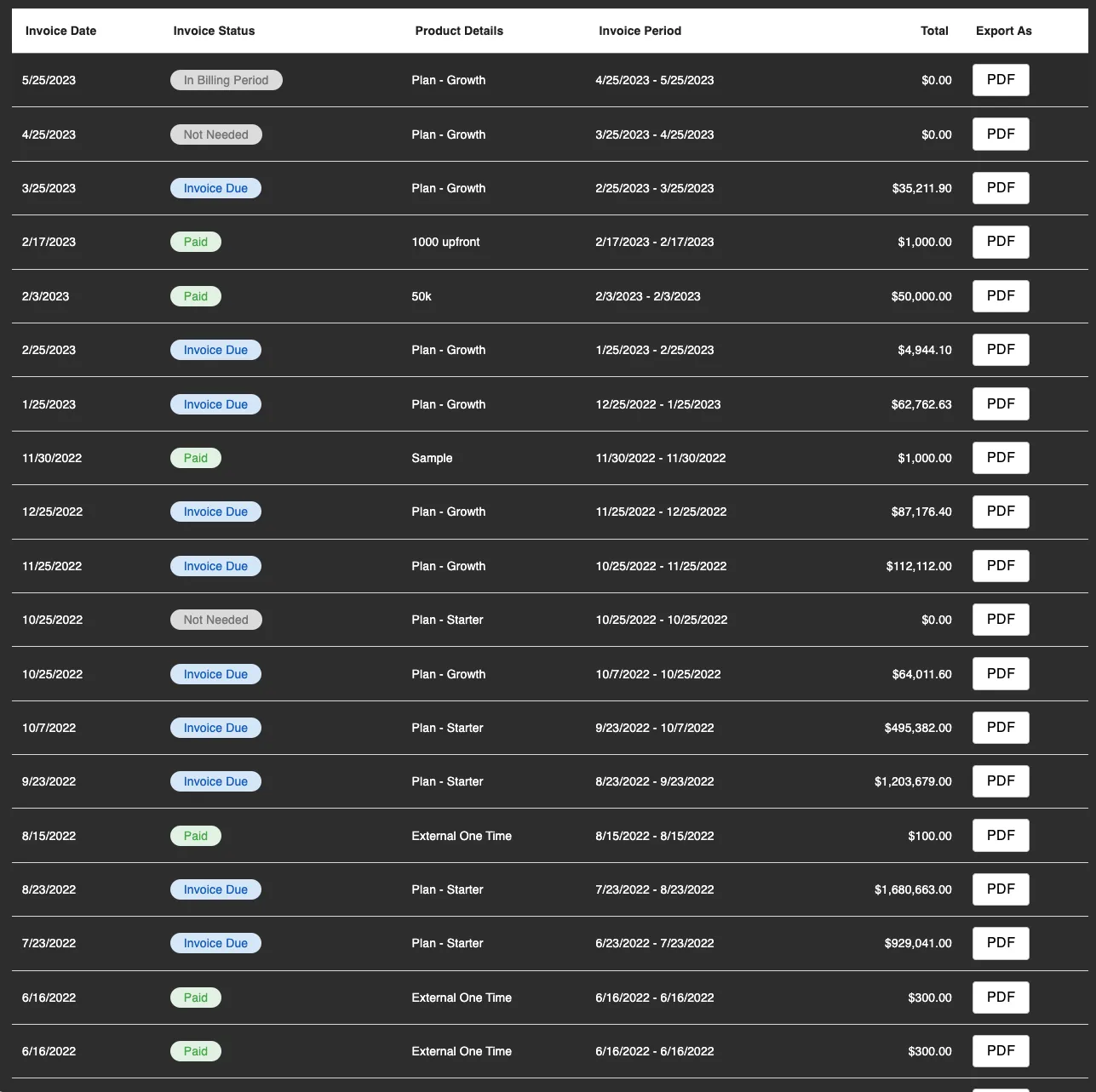
You can add some styles like:
.aflo-button .aflo-text {
    color: black;
}

.aflo-text {
    color: white;
}
This way you can change the text color for the whole components to white. And in the buttons that have a light background, we can set a dark color as black.
Types
Amberflo UI Kit is fully typed. If you're using TypeScript in your project, this makes it easy to view the expected properties for each component and understand the return types of functions and hooks.
Invoice-related Options
Several UI Kit components display invoice-related data, such as Invoice List, Invoice Details, and Invoice PDF. These components are influenced by settings configured under Amberflo | Settings | Invoice, which also apply to the Customer Portal and main Amberflo application.
Current invoice display options include:
- Displaying Cached Invoices Invoice data can be shown using either cached or real-time values. Cached data helps improve load times.
- Group Product Items on Invoices Product items can be grouped into categories, allowing for a clearer breakdown of consumption and billing.
How to
Read how to use the widgets, views and components in here.
Read how to use hooks here
Appendix 1: Full Code Example
import { useEffect, useState } from "react";
import {
  AmberfloProvider,
  UsageByMeterLineGraph,
  UsageByMeterTable,
} from "@amberflo/uikit";

function App() {
  const [sessionToken, setSessionToken] = useState(null);

  const getSession = async () => {
    const response = await fetch("https://app.amberflo.io/session", {
      method: "POST",
      body: JSON.stringify({
        // replace customer123 with an actual customer id
        customerId: "customer123",
      }),
      headers: {
        // YOU SHOULD NOT HAVE YOUR API KEY IN YOUR CLIENT SIDE CODE.
        // THIS IS ONLY FOR DEMONSTRATION PURPOSES TO TRY OUT A QUICK WORKING EXAMPLE.
        // Replace your_api_key with your account's API key.
        // Please see this section for more info.
        // (https://docs.amberflo.io/docs/get-session-token)
        "x-api-key": "your_api_key",
      },
    });

    const data = await response.json();

    setSessionToken(data.sessionToken);
  };

  useEffect(() => {
    getSession();
  }, []);

  if (!sessionToken) {
    // You can handle this many different ways (e.g. loaders, etc.), but we will just
    // return null until you have a token for simplicity.
    return null;
  }

  return (
    // When using UI Kit components, they must be a child of the AmberfloProvider.
    // Find out more about the AmberfloProvider here: https://docs.amberflo.io/docs/amberflo-components#getting-started
    // You will give need to provide it the sessionToken we receive from the
    // https://app.amberflo.io/session API.
    <AmberfloProvider session={sessionToken}>
      {/*
          A Usage Graph and Usage Table will be displayed
          populated with the usage of the customer you selected a session for above.
          Your account must have meters and the selected customer must have usage
          to be able to display any data within the table and graph.
      */}
      <div style={{ display: "flex", flexDirection: "column", gap: "2rem" }}>
        <UsageByMeterLineGraph withTitle withMeterSelector withContainer />
        <UsageByMeterTable withTitle withContainer />
      </div>
    </AmberfloProvider>
  );
}

export default App;